User Experience Guidelines for Microsoft Power Apps
Welcome to our User Experience guidelines tailored for enhancing apps created with Microsoft Power Apps, especially when used on hands-free devices. These guidelines are divided into three key areas: Oral (voice interactions), Visual (user interface design), and General (best practices). By incorporating these recommendations, your Power Apps solution will deliver an optimal experience on our devices.
General
Optimize your Power Apps for hands-free interactions by adhering to these principles:
Recommendations:
- Identify and prioritize hands-free use cases for your Power Apps solution.
- Minimize or remove features that are cumbersome for hands-free use, such as extensive text inputs or complex settings, to improve ease of use.
- Streamline navigation and remove redundant features that do not serve hands-free users, to keep the interface uncluttered.
- Label all buttons or text inputs as WearML will be unavailable, users need to interact by saying the label.
- Ensure all buttons are voice-enabled, as users will need to interact with the app using voice commands.
- Test your app on a RealWear device to ensure it is optimized for hands-free use.
Oral
Enhance voice interactions within your Power Apps with these guidelines:
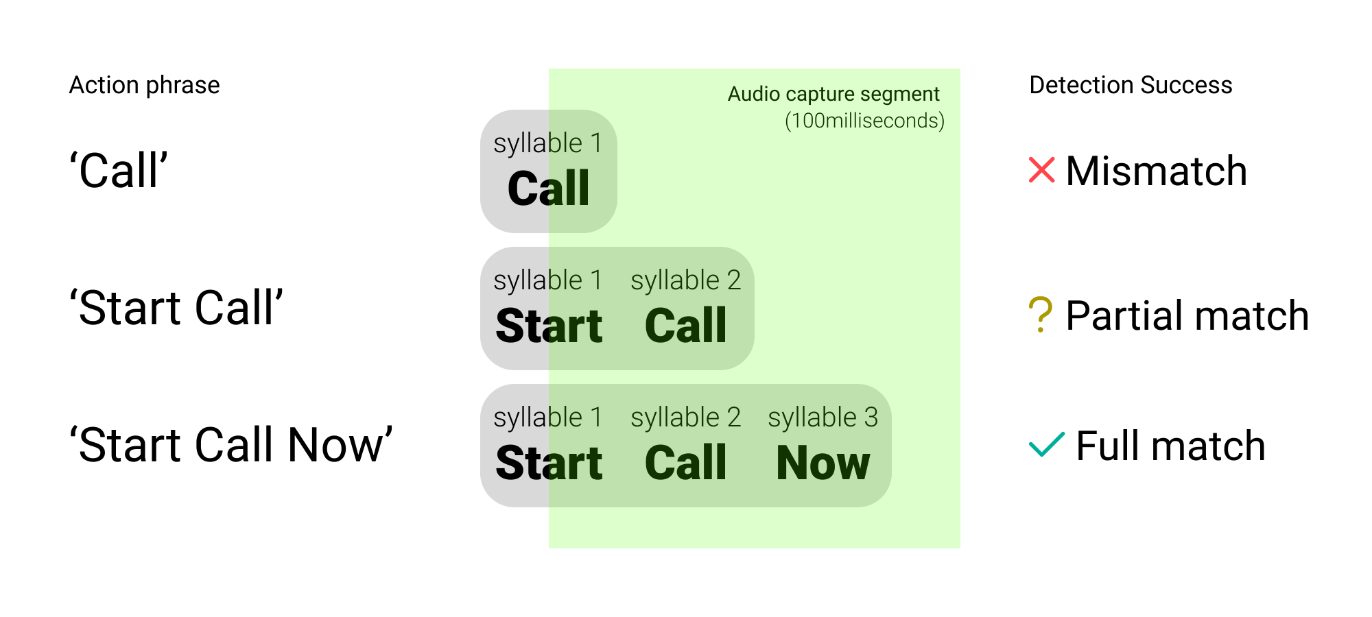
Use Multi-Syllable Voice Commands
For better recognition and execution on our devices, use voice commands consisting of two or more syllables. This approach minimizes errors and enhances user satisfaction.
 |
|---|
| This illustration shows how multi-syllabic commands are more effectively matched by our system. |
Visual
Ensure your Power Apps are visually optimized for our devices with these best practices:
Keep Text Legible and Concise
When designing your Power Apps, keep text clear and focused. Here are some specific tips to follow:
Recommendations:
- Ensure text is no smaller than 16sp, ideally 20sp or larger.
- Reduce the volume of text to maintain screen clarity and legibility.
- Use uppercase for button texts to differentiate voice commands easily.
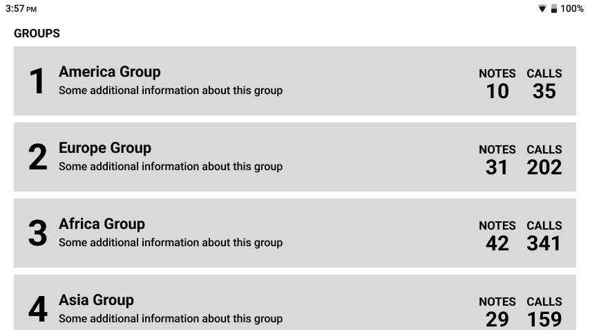
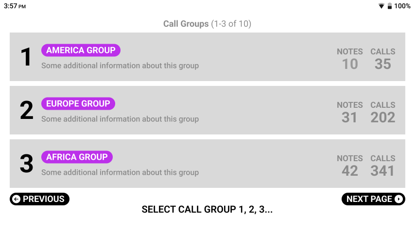
Simplify Screen Actions
Simplify the user interface to facilitate quicker decision-making and reduce user overwhelm.
| Bad Example | Good Example |
|---|---|
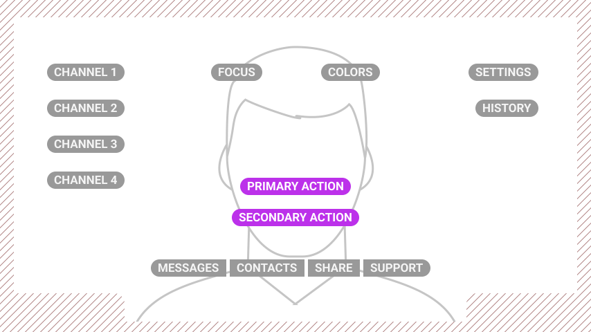 | 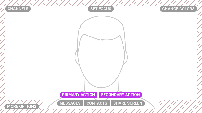 |
| Too many buttons clutter the interface, making it hard for users to navigate. | A streamlined interface aids in faster decision-making by reducing screen clutter. |
Respect Safe Areas
Design your Power Apps to keep critical visual and navigational elements within safe areas to ensure they are easily accessible.
| Bad Example | Good Example |
|---|---|
 |  |
| Elements at the edge can overlap with important visual information. | Relocating CTAs into the safe areas improves legibility and usability. |
Prefer Text Over Icons
In Power Apps, favor text labels over icons to prevent user confusion about what voice commands to use.
| Bad Example | Good Example |
|---|---|
 |  |
| Icons may lead to confusion regarding the necessary voice commands. | Visible text commands next to icons clarify user actions and enhance navigation. |
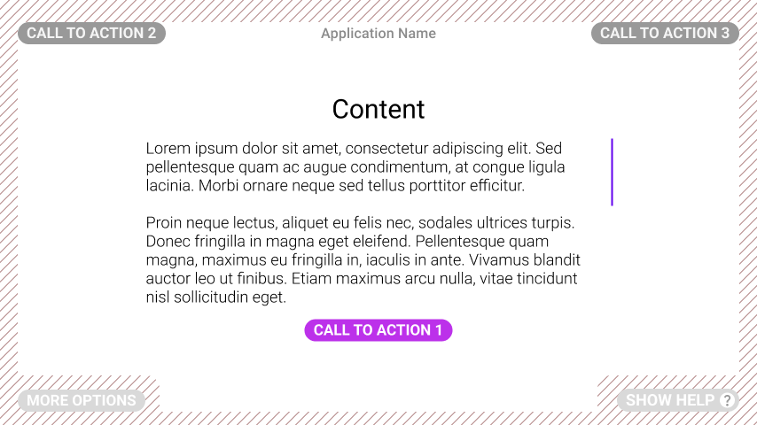
Make Interactions Obvious
Adopt a "Say What You See" approach in your Power Apps to help users quickly identify interactive elements.
| Bad Example | Good Example |
|---|---|
 |  |
| It's hard to tell which elements are interactive. | Interactive elements are highlighted to streamline navigation and user interaction. |
Choose Your Colour Palette Wisely
Selecting the right colors is crucial for accessibility and navigation in your Power Apps.
Recommendations:
- Opt for simple color palettes and sparingly use high-saturation colors.
- Avoid placing contrasting colors next to each other.
- Use gradients cautiously, especially behind text.
- Prefer dark text on light backgrounds and ensure your app looks great in both light and dark modes.
Color distinction issues on older devices may affect how colors are perceived, such as difficulties in differentiating blue from green. Always test your colors on the actual devices.